Project: VisualACA logo and website
Demonstrating simplicity for a complex process
Challenge
The health care industry is required to submit complex worker reports on a regular basis. Data is tracked differently than employers are used to and can be overwhelming. VisualACA automates tracking and makes filing easier.
Goals
- Graphically tie VisualACA to data-tracking
- Give an impression that it’s easy to use
- Have a separate look from the main company software but still coordinate well
Results
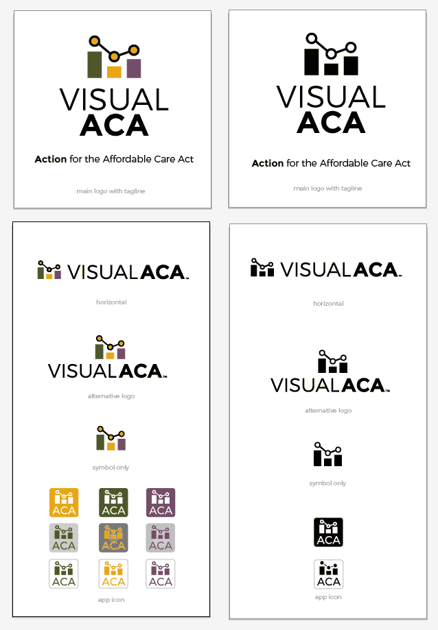
- Logo symbol relates to 2 different types of graphs
- Simple logo; website that is clean, and focused
- 3 dots on the graph relate to Attendance on Demand; logo colors are the same
The basic plan
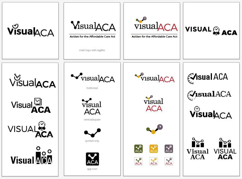
Logos can be used in expected ways, especially software logos, so I have alternates and app icons from the beginning. Setting up a visual style guide helps guide creating other pieces. This project had a quick timeline with overlap on the items, so it was nice to work with this team that was clear on objectives and articulate with feedback.
Logo
First I created quick digital sketches in black and white to get the design direction. Logos should be strong using just 1 color, so the design is finalized before adding the company colors.
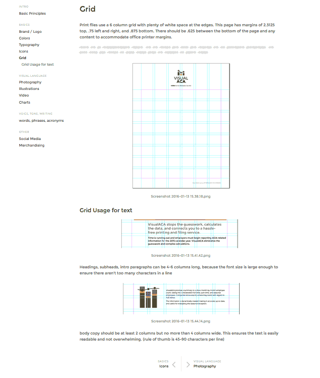
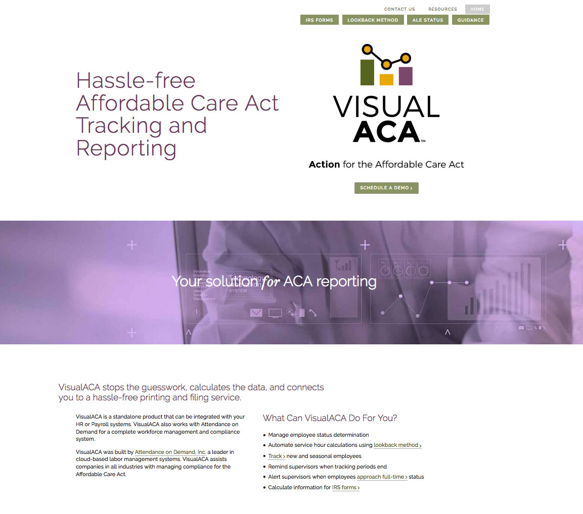
Website
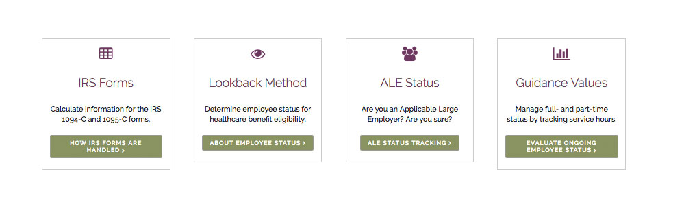
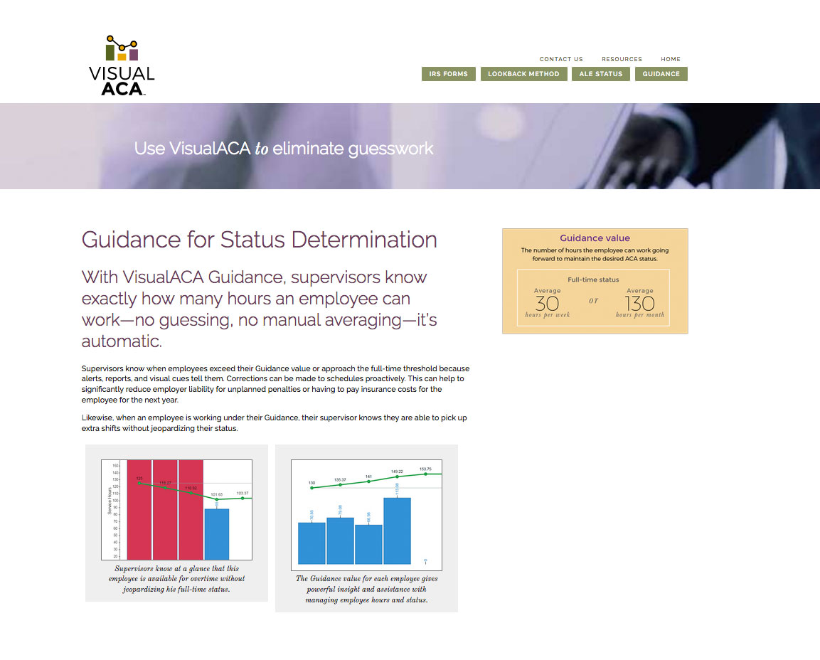
The website needed to be simple, clean, and be easy to update. I suggested using a card design for quick facts and an interesting grid to set the site apart from similar designs. Budget and timeline didn’t allow for custom photos so we opted to alter stock photos. Little bits of an italicized serif font adds some sparkle.
Keeping it simple
The site is in WordPress with a custom theme. Admins can easily update or add content because custom content boxes keep pages standardized.
Client History
Attendance on Demand has been a client for more than 10 years, so when VisualACA was launched I worked closely with the team to make sure the look is appropriate for the product and works within the corporate brand standards.