Project: trafficsafety.org website
Responsive website for traffic crash prevention group
Challenge
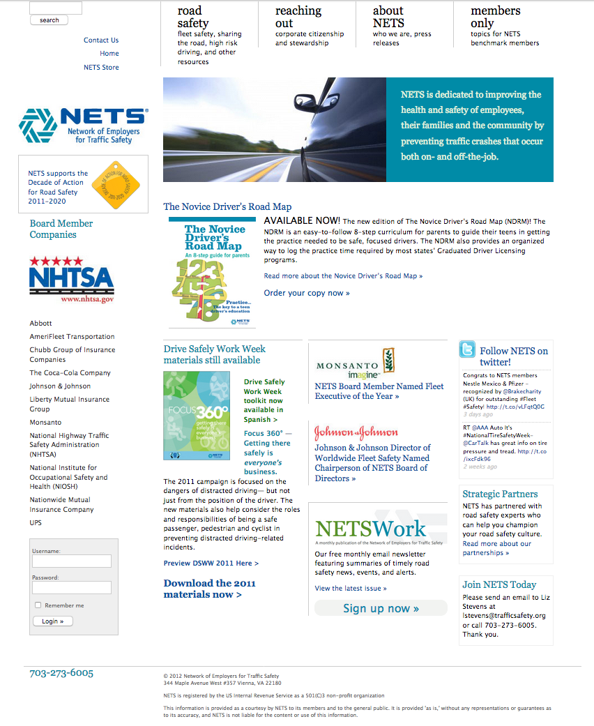
The site was last designed in 2009 and had become a bit dated and required a lot of effort to maintain. Visitors using small screens had a hard time reading the content.
Goals
- make the site easy to use on any device
- clearly define the resources available from NETS
- make sure the site reflects NETS’s professionalism and dedication to safety issues
- rework site administration so it’s easier to update content
Results
- responsive website works well on all devices
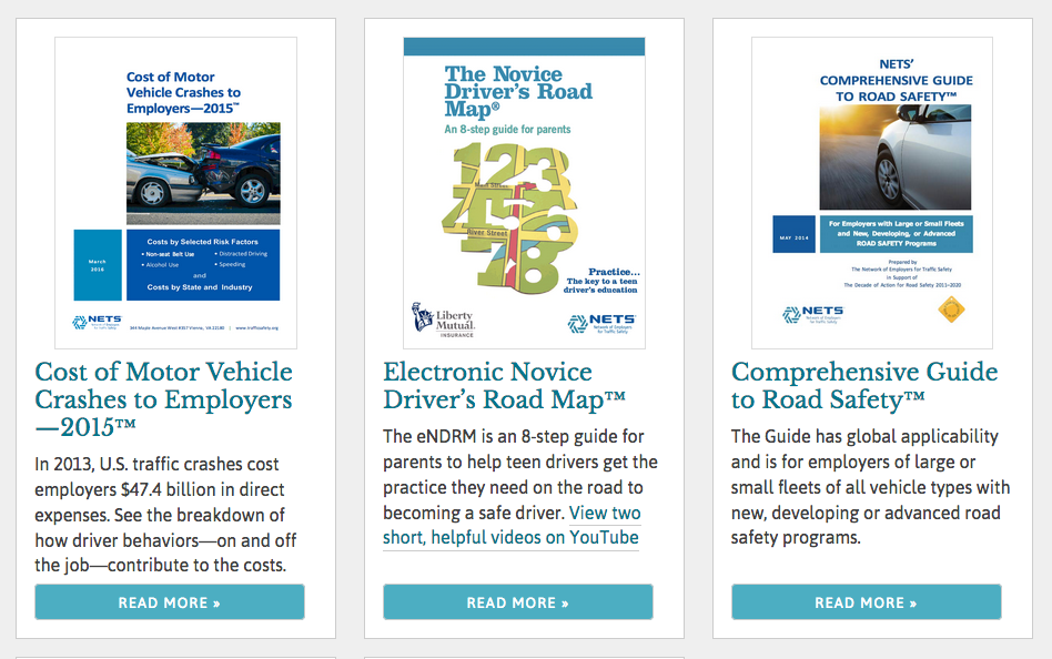
- NETS free resources and member areas are clearly organized
- elegant, modular design without unnecessary clutter
- site administration is simplified and organized
Work Process
Every website project starts with site goals and the content to reach those goals. Luckily, most content was reusable for this project so we focused on site organization. NETS creates safety resources and provides them free, so those had be most prominent. Site structure (and navigation sections) was an easy flow from that point.
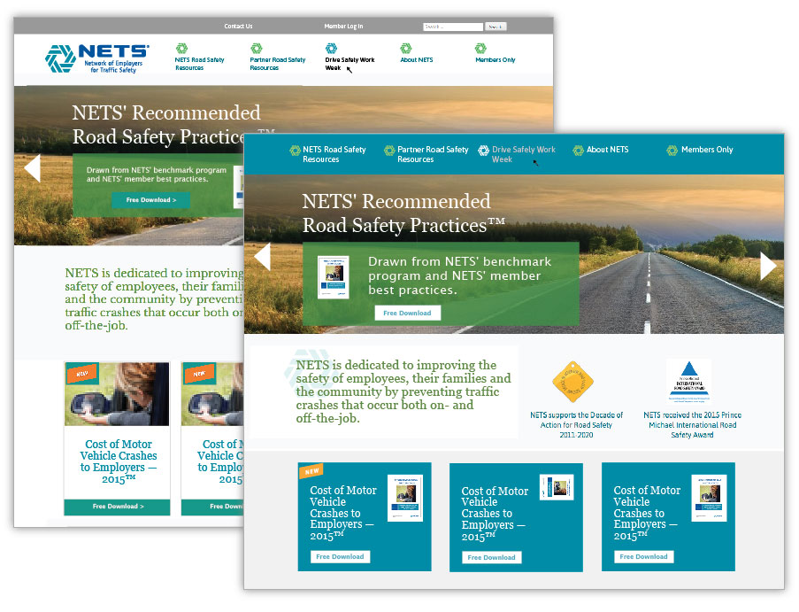
My design process is to work on the hardest page first, and the rest of the design follows that. In this case, the home page was the biggest challenge so we started there.
The home page
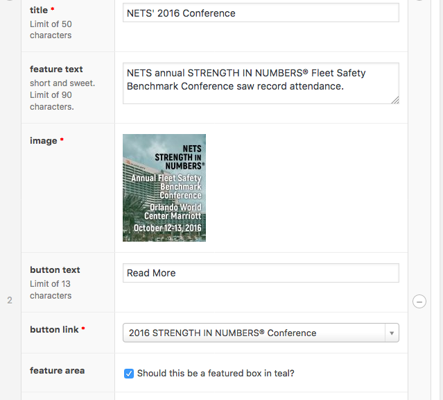
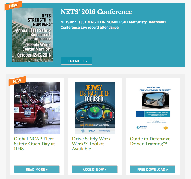
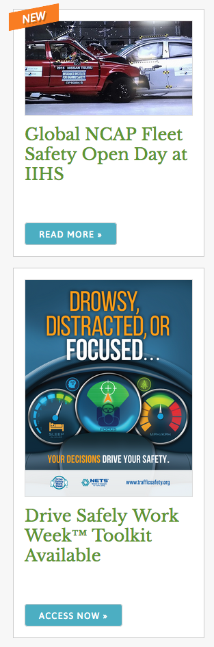
The old website involved some heavy html/css for each home page change, which meant NETS couldn’t edit it themselves. A new modular card design standardizes the content, which simplifies editing for the client while also keeping the design clean for site visitors. There are optional focus boxes in teal, and an optional “new” flag can be added easily.
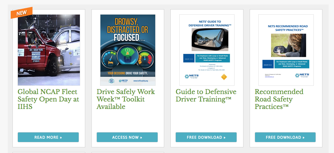

Extending the design approach through the site
The card design is carried into I set up WordPress templates to ensure the pages are standardized, which helps keep the site easy for visitors to navigate.
making content changes easier
Because we use WordPress, I also set up the backend to make updates easier. The challenges of maintaining design consistency while also making content admin user-friendly is rewarding for the technical side of my brain.
For example, the home page content is controlled from a single screen, and is easy to switch the order of items or change an item to “featured”. Simply checking a box will add the “new” flag.
Results
The site is responsive, so browsing from a phone or tablet is easy for visitors. This means the content moves so it stays legible at different widths.
Because we clarified the site goals at the onset, the site structure was easy to define, which in turn made the design process easier. And adding content in the admin area is easier because there are pre-defined sections and character limits when appropriate.
Client History
I've been working with NETS on the trafficsafety.org website since 2009. We were proud of that site, and our small distributed team worked well to maintain it. But, as it often does, the content focus had shifted and technology needs change. Working on this iteration was a lot of fun.