Project: Eagle Thread Verifier
Crisp look for manufacturing support company
Challenge
Logo, marketing pieces, and web site to show ETV as reliable, strong, and reputable
Goals
- Logo featuring an eagle and using blue to keep the look familiar
- Marketing pieces that are easy to read
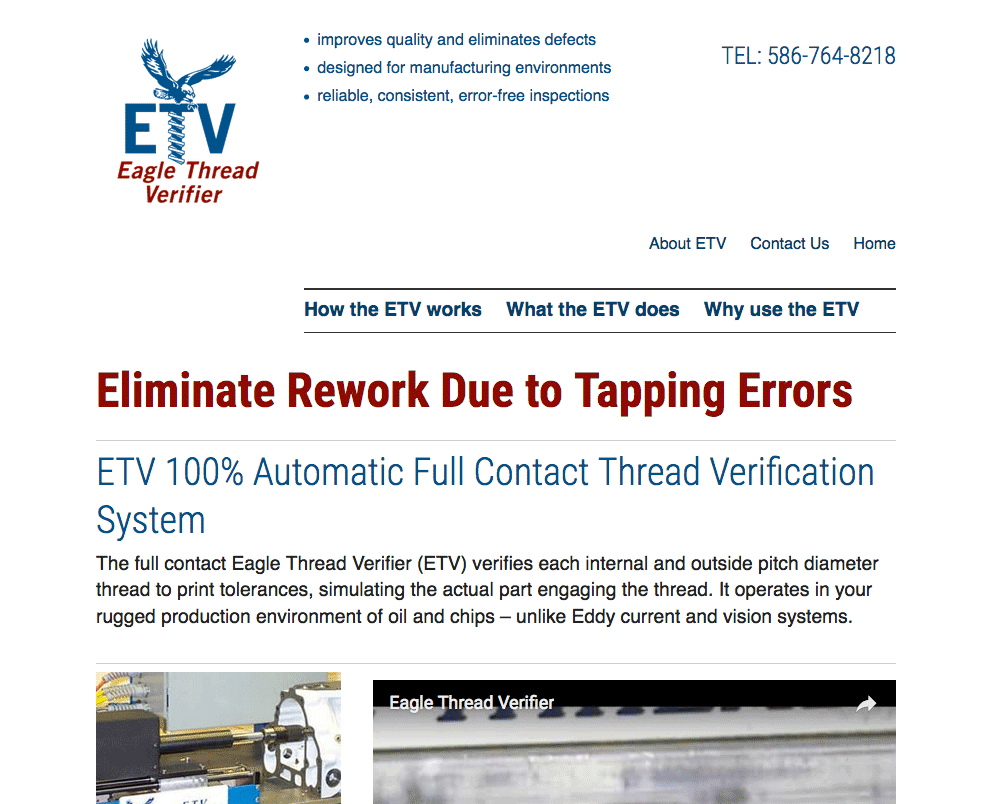
- website to coordinate with print pieces and be easy to update
Results
- Clean logo with updated color scheme
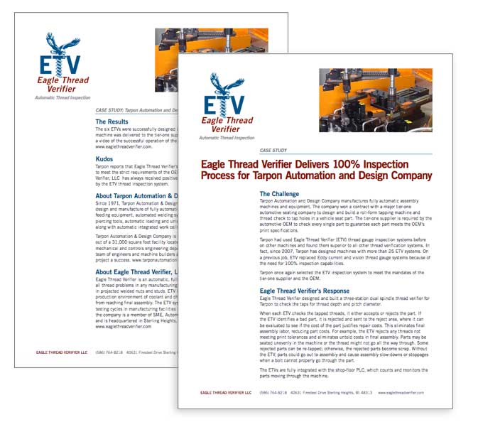
- print materials featuring a lot of white space, strong typography, and a strong grid
- custom WordPress site with clear navigation
What I like about this project is the clean look without frills or fuss. The red is used only for the company name and headlines; other text that needs to stand out uses the blue. Lines are only in grey and used sparingly. The type is only sans-serif, and is either text or a subtitle, and goes in one area. It reminds me of an organized person who gives the info then gets to work.
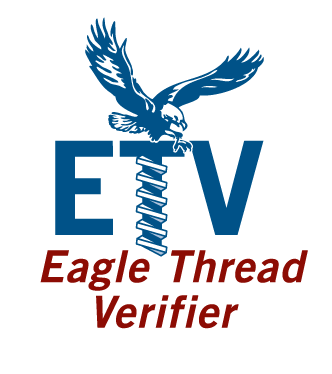
The logo
Their old logo had the eagle with the company name in a serif typeface in all caps. I changed to a sans-serif font to give a stronger impression, and added some deep red to make the logo pop more. This company does just one thing—verifies threading of parts—so using an image of screw threads in the logo is safe call.
Marketing pieces
Print pieces use a two column grid that highlights the logo and headline. Text is sans-serif and strong hierarchy makes it easy to read. The website matches the hierarchy and was reworked in 2016 to be responsive, and to move most content to the home page, to eliminate the need to click to multiple pages to learn the basics.